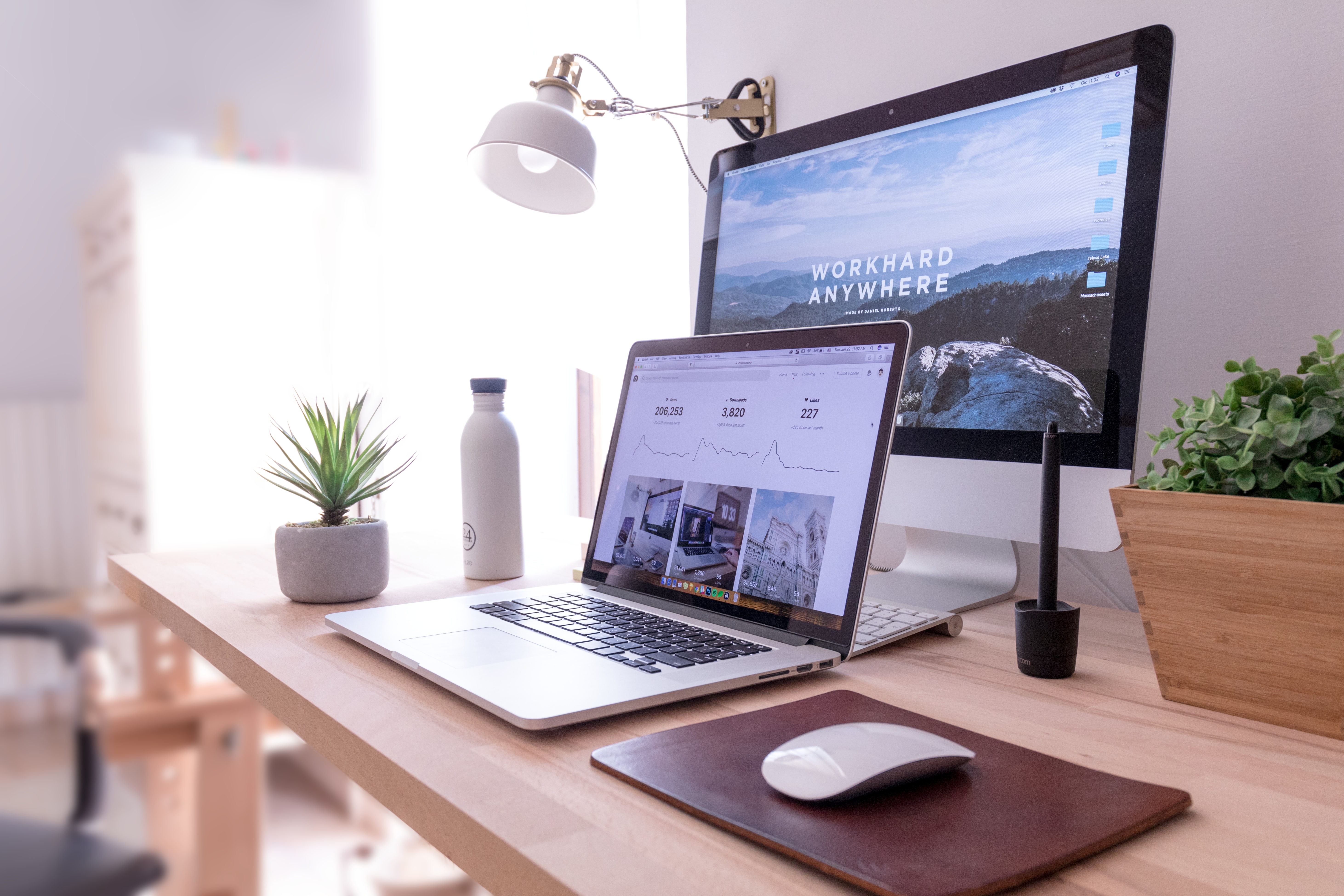
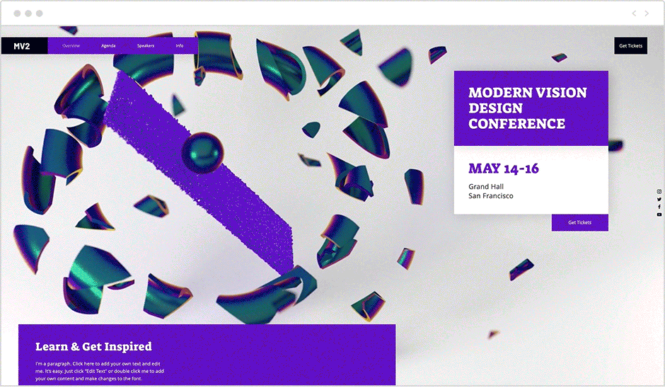
In order to communicate clearly and instantaneously, websites are favoring large, prominent elements. This magnitude in design applies to just about anything on a webpage, from big, bold typography, to fullscreen images and videos, and even oversized website menu icons.
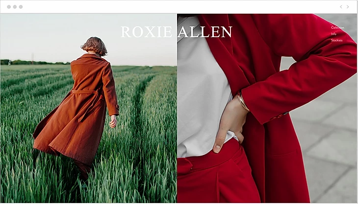
Have more than one idea to convey, but still want to retain an uncluttered look? Consider splitting your screen down the middle, allowing each side an equal spot in the limelight. This captivating web design trend breaks the rectangular mold in two and each side can behave differently.
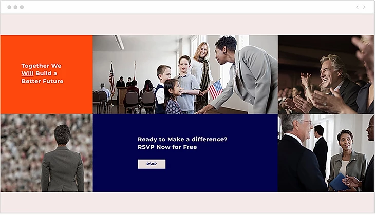
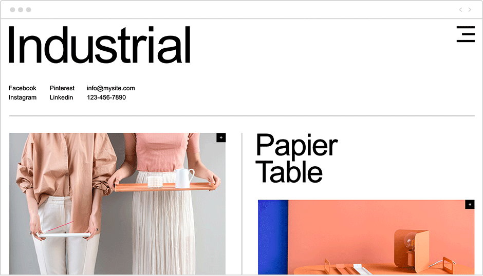
Continuing on the split screen trend, some websites break up their content into even more parts, resulting in an array of differently sized squares and rectangles that are separated by color. This look can express several messages at once, in an orderly and cohesive manner.
The overarching design theme for this year is large elements surrounded by generous amounts of whitespace. It’s therefore only natural that this trend has found its way into more seemingly mundane niches of web design, such as the online form. Online forms play an integral part in so many of our web interactions, from signing up to a service, to filling in our delivery information on an online store, and much more. Yet at times, they feel like a tedious chore, and users often refrain from filling them in. The simple act of expanding a form so that it takes up more room on the page, makes it more inviting to interact with. As a result, fullscreen forms can improve user experience. Another feature that can increase the likelihood of users filling out and submitting a form, is micro-interactions that respond to the users’ actions in real time, guiding them through the process. For example, subtle design changes can signal that a certain field has been filled in, and feedback messages can mark a successful form submission.
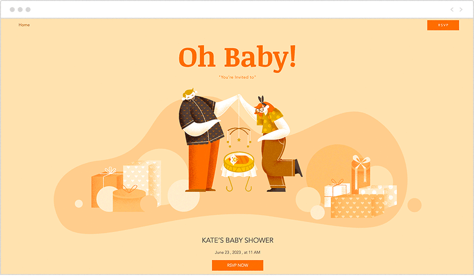
Websites harness a plethora of visual tools in telling a compelling story. With anything from illustrations to icons and photographs, visuals are no longer just placeholders to merely add some color to the page. Instead, web design is intentional in its use of imagery, utilizing visuals to support the message and craft a brand identity. Indeed, the right placement of illustration can make a big difference. For example, think of a skateshop’s website that’s full of street-art inspired graphics. In comparison, a nonprofit website whose feel-good visuals bring up a sense of optimism, sends a different message altogether. To form a coherent visual language that encapsulates your brand’s vision, browse vector art collections for unique illustrations, icons and badges. Additionally, invest time in going through high quality media features to find images that are perfectly tailored to your brand’s specific needs.